GEHA
GEHA needed a refreshed brand direction.
Client
GEHA
Services
Branding, Brand Collateral, Icon Design, Web Design
scalable
branding
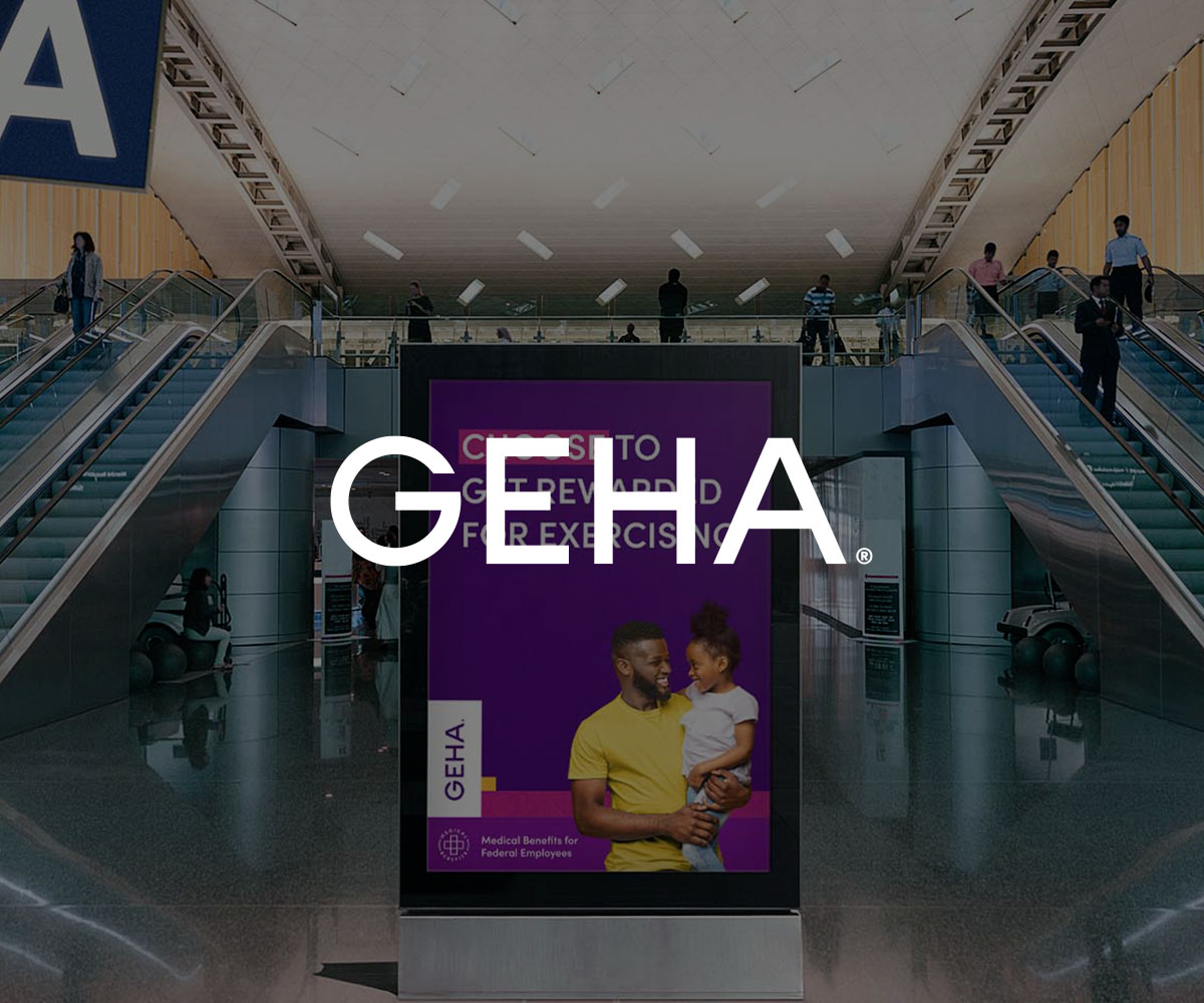
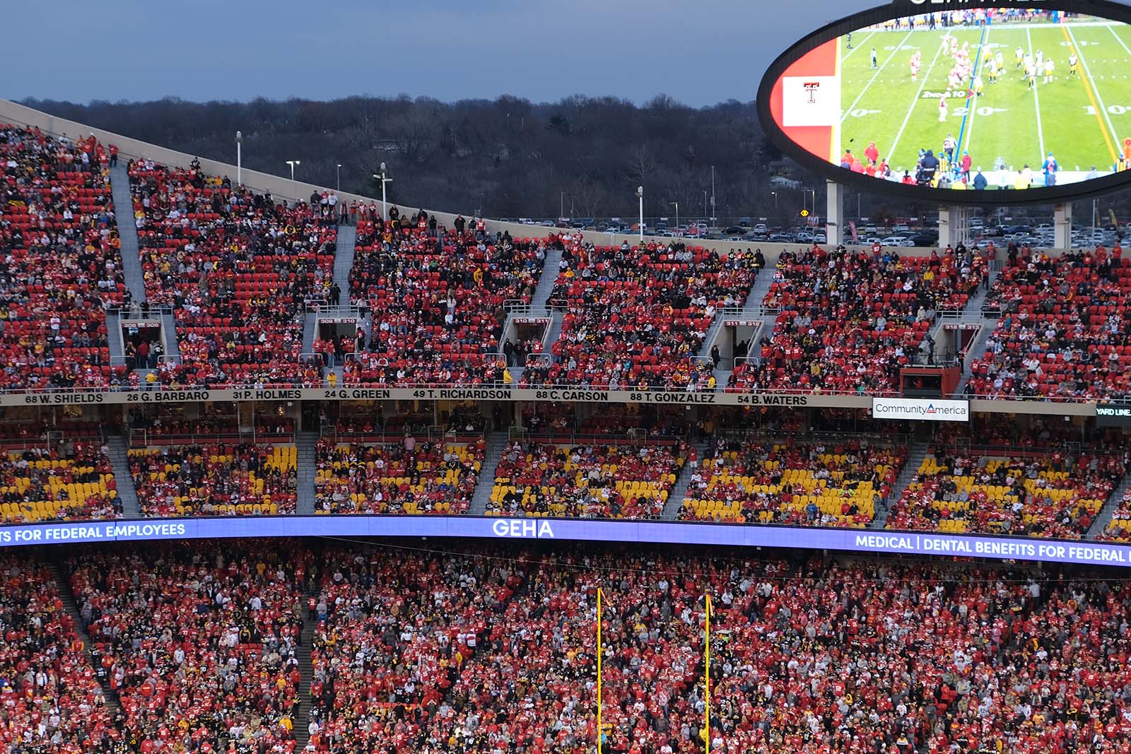
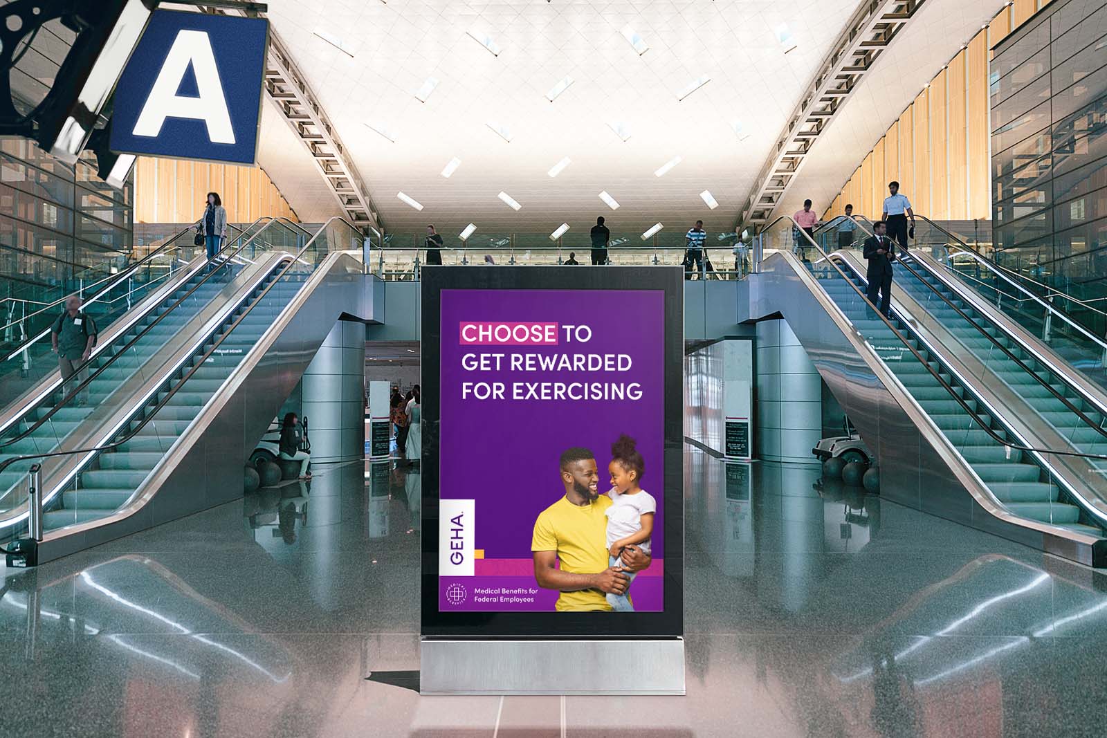
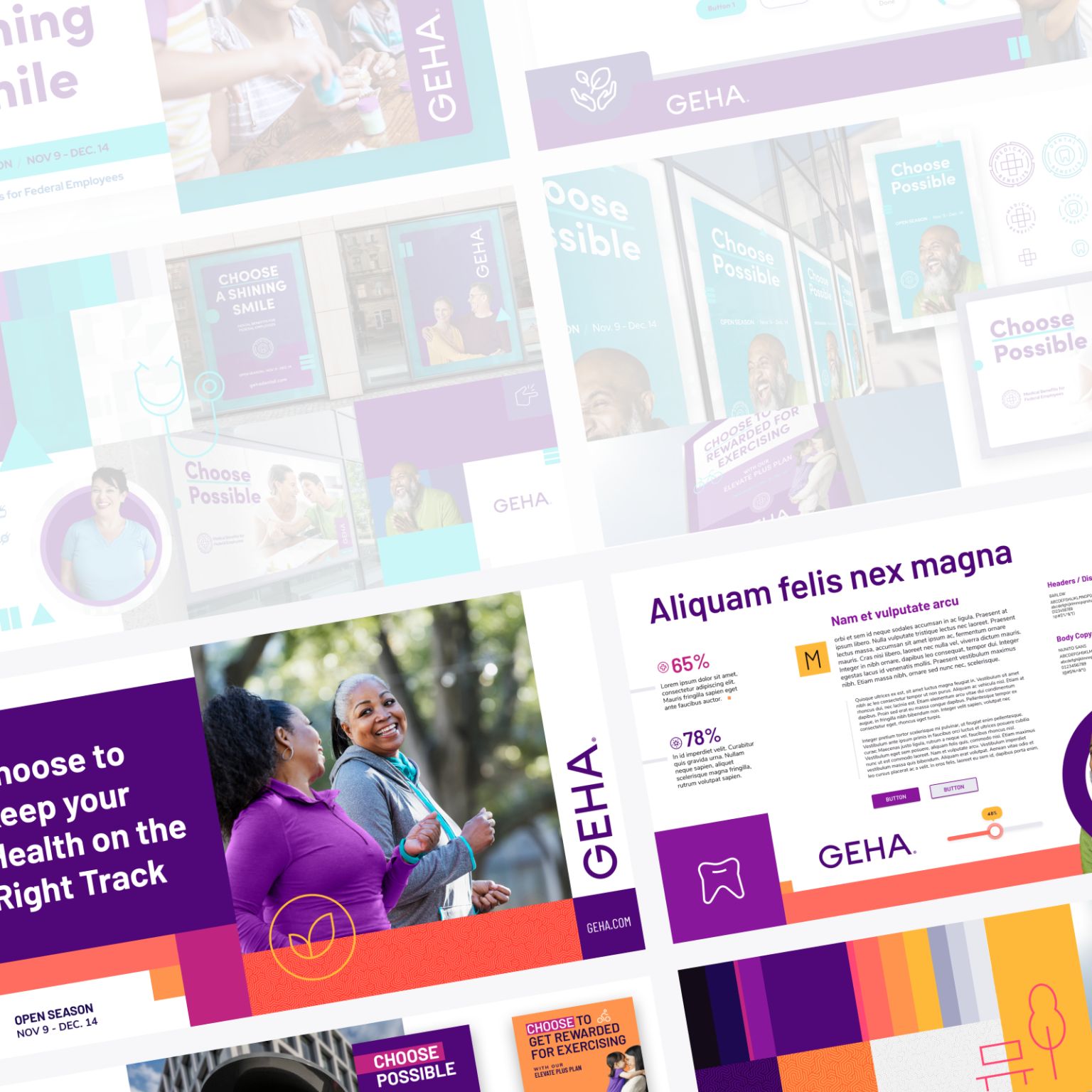
GEHA needed a refreshed brand direction ahead of their move into the newly renamed Chiefs stadium in Kansas City. Their existing identity felt dated and muted, and the organization was ready for a more modern, cohesive look.
I partnered with the team at Merge, working independently on the full creative exploration and execution. Art Director Josh Liotta provided occasional feedback and helpful client insights along the way. Brian works with a variety of advertising agencies and design studios and is available to integrate into existing creative teams as needed.
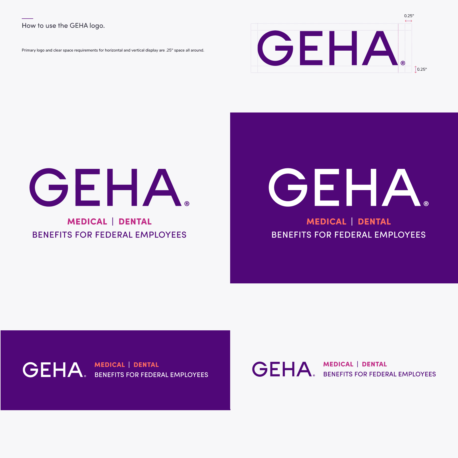
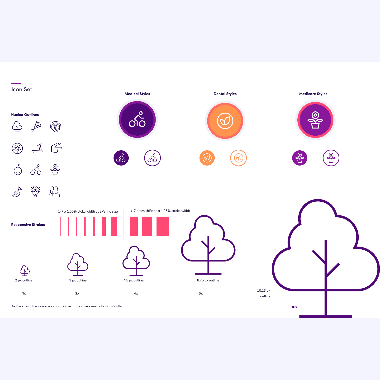
The previous GEHA brand lacked visual clarity and consistency. To establish a stronger foundation, Brian White Design created mood boards and style tiles that explored brighter palettes, clearer typography, and more accessible visual elements. This work developed into a complete design system featuring updated patterns, icons, and digital components. As the system came together, I extended the refreshed look into GEHA’s website and email marketing to create a cohesive, modern digital presence.
It’s rare to be given the freedom to explore without limitations. For this project, I was trusted with significant creative space to iterate, ideate, and determine the best direction for GEHA’s refreshed brand. Nearly every foundational element was reconsidered. With a clear starting point and room to think, I was able to build a design system that felt modern, adaptable, and easy to apply across a wide range of formats.
I presented two distinct style tiles—one centered on cool tones and one warmer and more welcoming. The warmer direction ultimately became the foundation of the new system. I later had the chance to see some of the work in context at Arrowhead during a Chiefs–Steelers game, which was a great moment to see the brand elements in use.
Note: I did not create the GEHA logotype but did the updates and brand identity lockups.